After spending the last year celebrating its past, Rehoboth Art League kicked off its 76th year by planning for the future.
First, the art league has introduced a new logo: the lowercase letters "ral" shaped like tree branches. Executive Director Sheila Bravo said the theme of the tree was meant to symbolize the art league’s roots in the past and creativity within a natural setting.
She said the art league decided to change its logo, which depicted a branch on a painter’s palette, because officials did not want the art league to be thought of as a painters-only facility.
At its June 19 meeting, the art league also laid out strategic plans for the year. Perhaps the primary focus, Bravo said, will be preserving and restoring of the art league campus. She said projects include installing air conditioning in the education building, improving accessibility to the facilities and adding more pathways and ramps.
Bravo said the league is also looking at growth beyond the Henlopen Acres campus.
Last year, the art league opened its Rehoboth Avenue annex at the former McQuay’s Marketplace, which was meant to be a temporary arrangement. Bravo said the art league has been looking at other sites for satellite campuses, but she declined to say where.
The art league also plans more exhibitions, Bravo said, particularly in media other than painting such as photography.
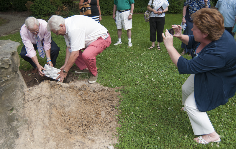
To cap off the art league’s Diamond Anniversary celebration, which began with a reenactment of the floating of the Chambers building down the Lewes-Rehoboth Canal, the art league buried a time capsule of artifacts from the 75th year. Among those items, Bravo said, were memorabilia and letters to future presidents and boards of directors. The plan, she said, is for the capsule to be opened during the art league’s 100th anniversary.


